An Adobe Firefly Review For Marketers And Creatives
I got my invite into Adobe Firefly Beta a few days ago and began experimenting with the visual generative AI. Reports of the image creation…

I got my invite into Adobe Firefly Beta a few days ago and began experimenting with the visual generative AI. Reports of the image creation lagging behind Midjourney and Stable Diffusion are accurate, but the gap is less than I had expected.
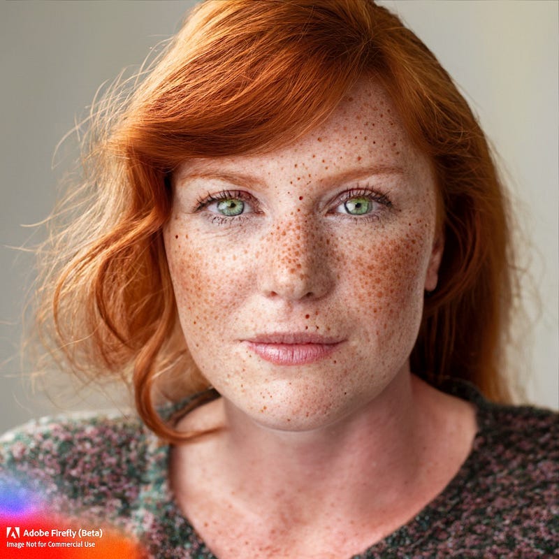
The images themselves have their unique flavor and animated look. Firefly animations are comparable to or perhaps a little behind Midjourney v4. Photorealistic images of landscapes are also comparable to v4, but portraits are shockingly good.
However, Firefly is not ready for prime time and the Beta terminology is accurate. What I find most annoying is the watermarking on each image. Adobe’s reasoning is transparency and ethics, but I suspect marketing also played a role in the hard-to-miss red branded watermarks. These make the image unusable without manipulation.
Outside of creating photorealistic images and the annoying watermark on every image, Adobe Firefly has much to like for marketers and creators. I have no doubt usability will dramatically improve as the engine moves out of beta. Perhaps Adobe’s reserved launch is best as it trains its engine and builds out functionality.
I look forward to seeing how the engine evolves with its image creation as well as Firefly’s roadmap of future capabilities. Those include promised features like inpainting, image prompting, image extension, 3D vectors to images, sketch to image, and integration via Creative Cloud for Photoshop and Illustrator editing.
Below find four in-depth review points, including a head-to-head battle on portraiture between Adobe, Midjourney, and Stable Diffusion.
1) The Interface Is SO MUCH BETTER
Perhaps the best aspect is the many filters and professional interface that anyone familiar with graphic design, photography, or social media marketing will appreciate. This was the great expectation for Adobe’s entry; a better more utilitarian interface closer to the experience professional creators are accustomed to.
I have learned how to prompt using Discord for Midjourney and can type in prompts into Stable Diffusion. However, these basic engines lack the controls I expect from a professional interface. While the outputs are amazing, when you don’t get the right image, you have to keep tweaking your prompt until you get an acceptable outcome. Or not.
Firefly improves generative imagery by providing some common social media-esque filters that have become normalized by mobile visual editing apps like Photoshop Express and Google’s Snapseed. The end result is image manipulation via filters, something that every Instagrammer and TikToker on earth has come to expect.
2) Photorealistic Images? It’s Hit or Miss
Adobe Firefly offers a gallery of prompts for those who want one, I took the above sand castle prompt and applied a few filters to get this. While I selected photorealistic, the above image still looks like a computer-generated image to my eye.
What about people, you ask?
When prompted well and using the photorealistic filter and the studio lighting option you can get some fantastic results. Consider the below portrait I generated in under two minutes!
Crazy train. This is as good as Midjourney, better in some ways when you consider that soon you will be able to touch up these images in Photoshop. For a head-to-head comparison, here’s what Midjourney and Stable Diffusion produced with the same prompt.

And for shits and giggles the oft-touted but personally disliked Stable Diffusion.

Yeah, those Stable Diffusion pupils need some work. That was the best of eight variants.
3) Powerpoint Fans Will Like the Letters
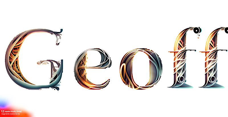
Powerpoint fans and those who maintain brands are going to have all sorts of fun with turning wordmarks (and I assume eventually objects) into art-filled letters. This is highly usable for situations and holiday and branding initiatives.
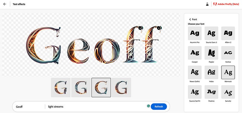
Like its image generation tool, Adobe allows users to use filters to apply different fonts and styles to the lettering. You can see the interface below.
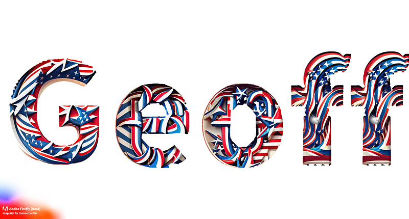
However, I do think this is where some of the generative AI capabilities lag behind the competition with somewhat imperfect imagery. Here is a late St. Patricks Day version of my name.
And a Fourth of July version. Meh.
4) Vector File Color Variants
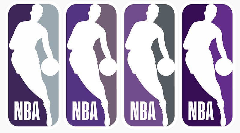
Brands are going to scream or rejoice depending on their perspective about consumers riffing off their logos. The above four variants of the NBA logo were created using Adobe Firefly’s recolor vector files feature.
This opens up some of Adobe’s Illustrator capabilities to the average Internet user, democratizing graphic design for the masses. And I think marketers will use it for initiative-specific efforts, again depending on how much play they can interject into campaigns.
In Conclusion
Though not ready for primetime, Adobe Firefly has a bright future. I look forward to seeing how it continues to evolve as a professional-grade AI image generator. In the interim, I think Midjourney is still the leader and the go-to source for AI-generated images for now.
For additional tools and resource ➡️ Visit StartupStash
Zendesk is giving $75,000 in credits and perks for startups! ➡️ Apply Now!


